Reducing Cost-to-Serve
A Systemic Approach to Building User Trust
🏢
GrabFin
🗓️
2022
🚀
Launched
🎯
-15% Cost-to-Serve
Identifying the Opportunity
While analyzing customer support patterns across GrabFin's payment services, I identified pre-authorization related inquiries accounted for over 11% of overall CE tickets in Southeast Asia. A hidden cost-to-serve inefficiency that had not being quantified until then.
Beyond the business impact, I saw a deeper issue i.e users fundamentally did not understand what was happening with their money during booking failures. This created a trust gap that could undermine our overall GrabFin strategies. I knew this was not just a communication problem to solve. It was an opportunity to establish how we think about building trust at critical moments throughout the platform.
Pre-authorization Context
Pre-authorization places a temporary hold on funds in a user's credit or debit card to reserve products or services, making those funds unavailable for other transactions until the hold is released or captured by the merchant.
The Problem
Users believed they were charged for unsuccessful Grab bookings.
My Role
To improve user trust and confidence in card payment methods, I spearheaded a cross-vertical initiative to align the Transport, Food, and Logistics teams under a unified communication framework. Additionally, I worked with the Product Marketing Writer to enhance help center articles, significantly increasing their helpfulness.
Early Inights
Dialogues with various stakeholders enabled me to map out the user journey during unsuccessful bookings. Users typically received charge notifications from their banking apps, leading them to believe they had been charged. This misunderstanding intensified as they navigated the journey without finding answers to alleviate their concerns.
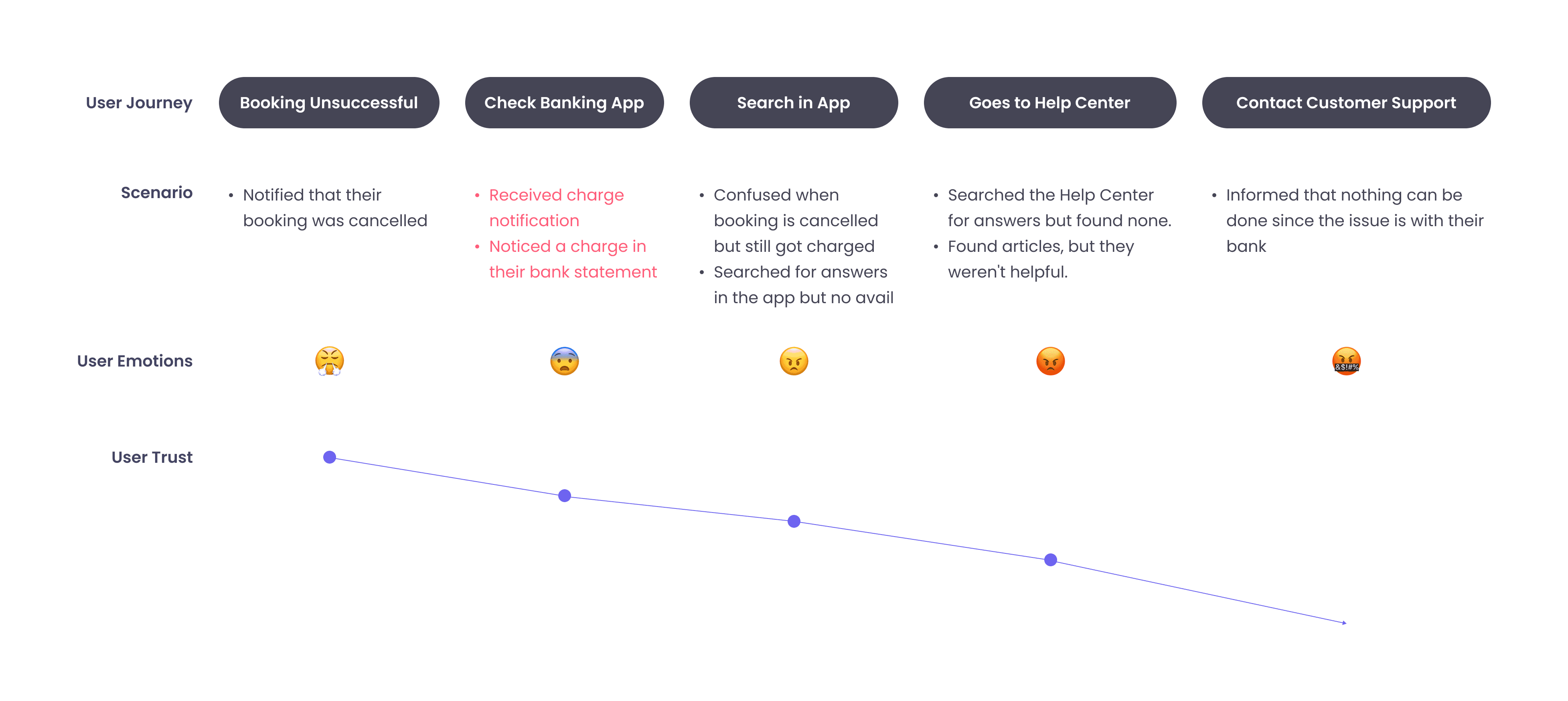
Deeper Insights
In discussions with country teams, I discovered two primary reasons users contacted customer support:
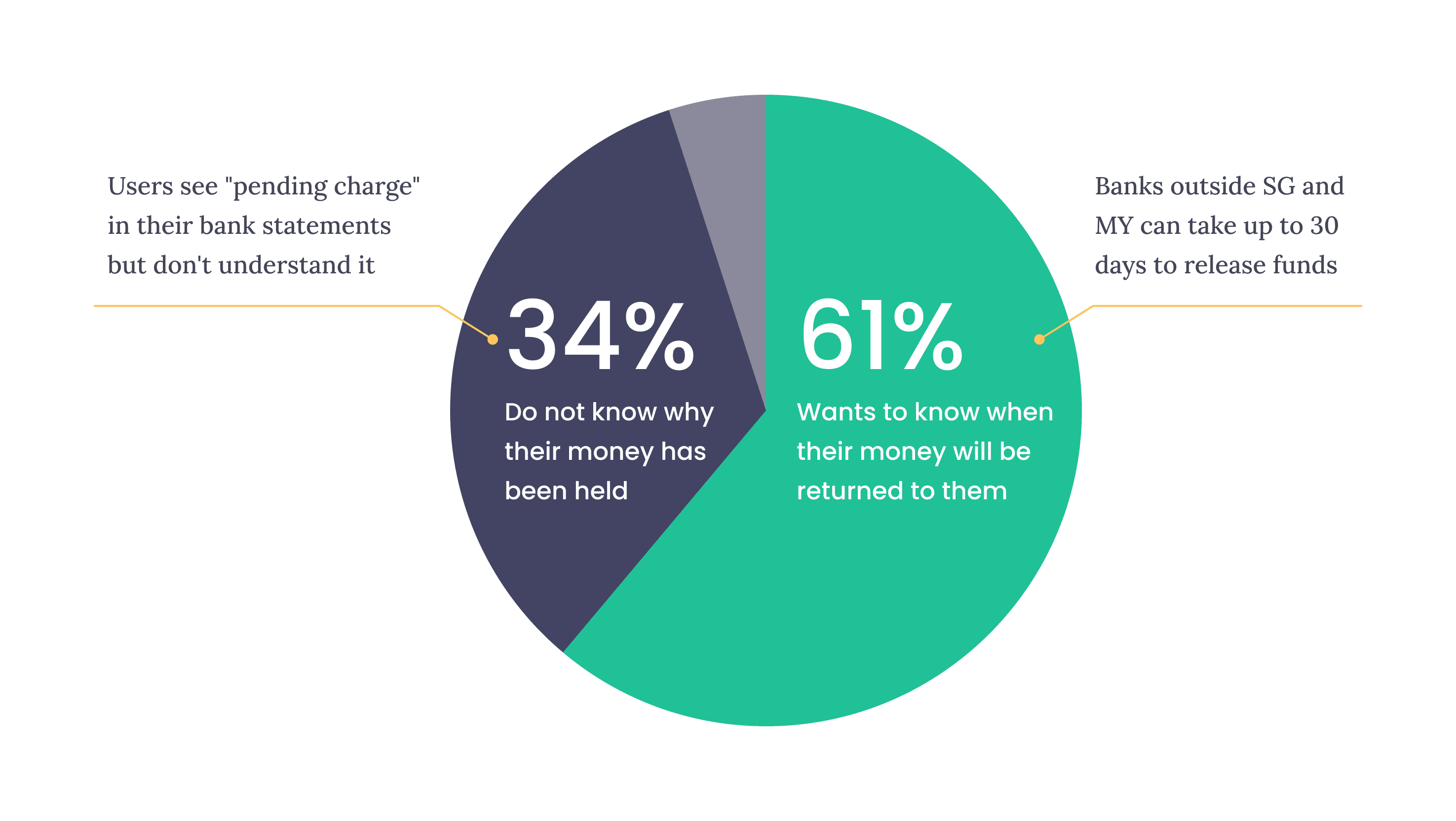
Additionally, banks typically do not notify users when funds are released from a pre-authorization hold, prioritizing alerts for charges instead.
Choosing Our Battles
Based on my research, I saw three possible approaches we could take:
High effort, high impact – Focus on preventing the problem by changing payment flows, which would be highest impact but require massive cross-team coordination.
Low effort, low impact – Educate users proactively through pre-booking messaging, which was fastest but might get ignored.
Low effort, high impact – Intervene at the moment of confusion with contextual information, which balanced feasibility with impact.
I advocated for the third approach because it gave us quick wins we could build on while laying groundwork for the systemic changes we would eventually need. I presented this framework to the team and secured buy-in by showing how the contextual approach would generate learnings we could apply org-wide.
Identifying Gaps
Since we couldn’t improve how local banks communicate with users, we focused on addressing our own communication issues. Collaborating with external teams (i.e Transport, Food, and Logistics), we identified UX gaps in a typical pre-authorized booking flow.

The combination of delayed notifications about fund releases in our app, local banks not releasing funds immediately, and misunderstandings of "pending charges" led users to assume they had been charged.
Opportunity
HMW enhance pre-authorization to build user confidence that Grab did not charge for unsuccessful bookings?
The Strategy
Improving the user journey
My goal was to ensure users trusted that they were not charged for unsuccessful bookings by minimizing their need to contact customer support.
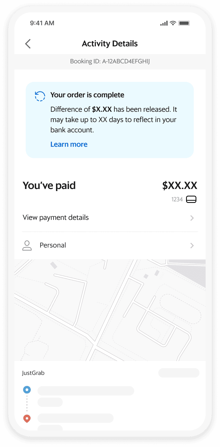
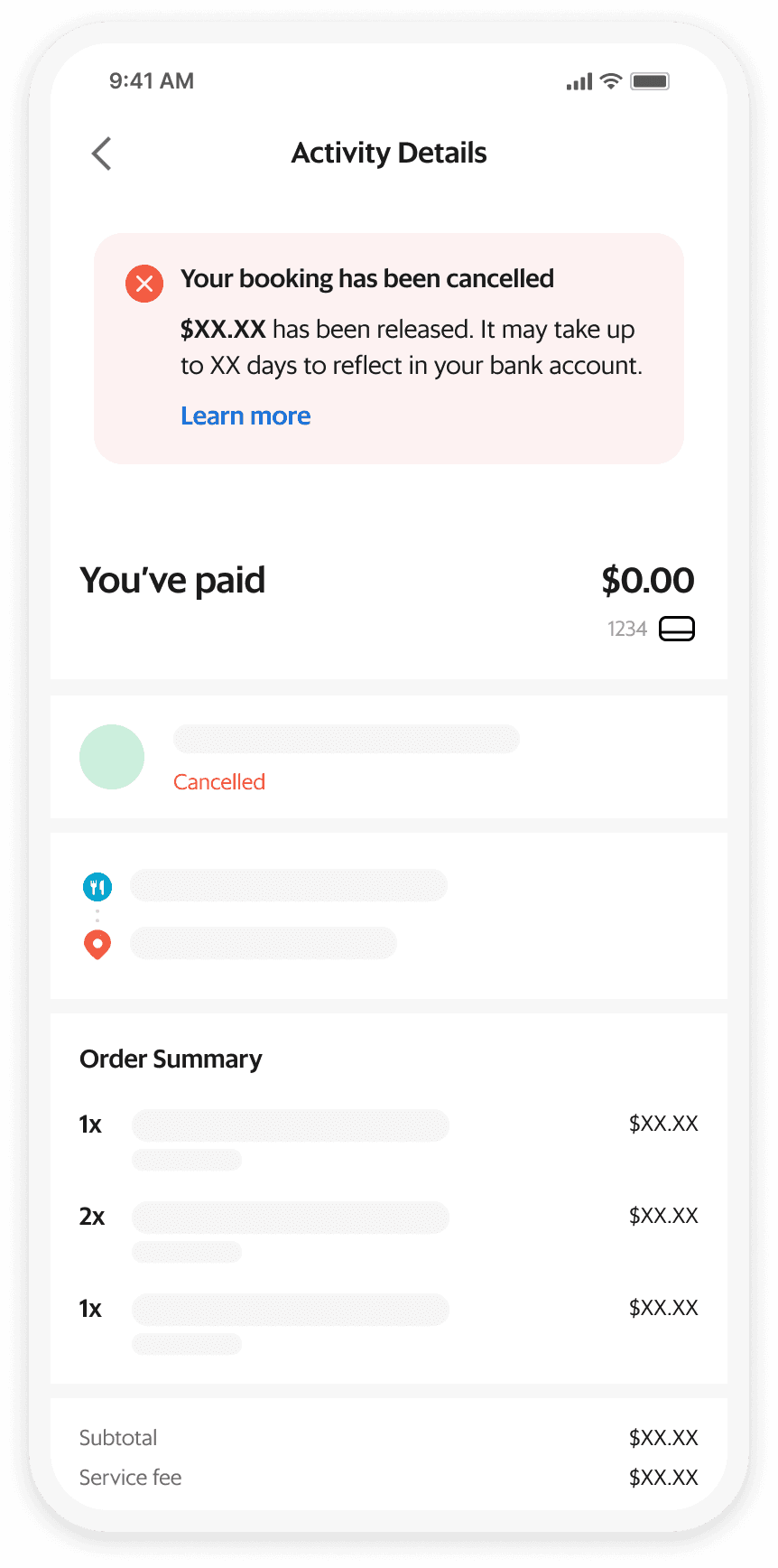
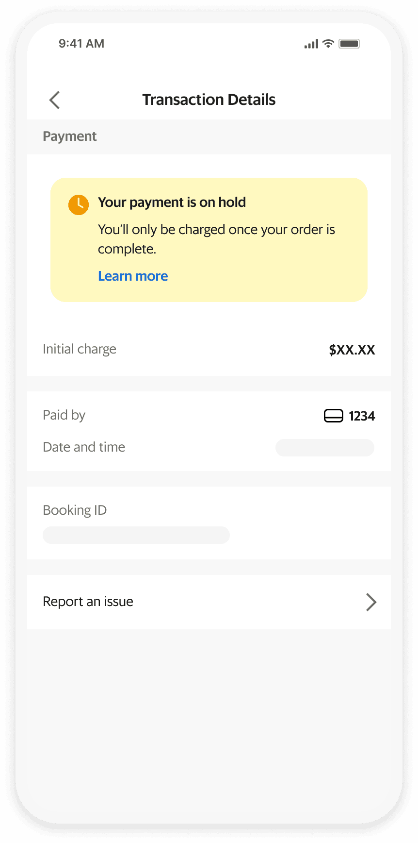
We need to provide timely alerts for each pre-auth event and make it easy for users to find information regarding pre-auth post-booking. Most importantly, all messages had to be concise yet informative.

How We Got There
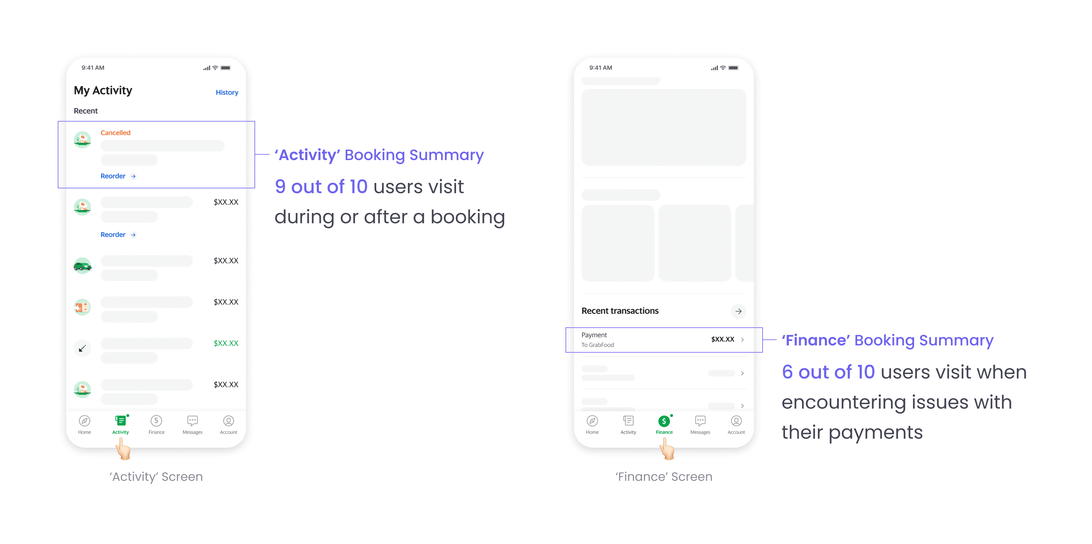
Where users go after a booking?
Quantitative insights from Product Analysts indicated that most users check the Activity booking summary during and after bookings — a behavior Grab has encouraged over time.
Some users also navigate to the Finance booking summary particularly when facing payment issues. These insights informed my team’s decision to include pre-auth information in both booking summary screens.
Constraints and challenges
The constraint of minimal iterations from external teams was not just a technical limitation. The challenge as well was each team (i.e Transport, Food, and Logistics) had different priorities and timelines.
Therefore, I needed to design a solution that worked for all with minimum effort and yet high impact. An elegant solution that would be good enough for users, while being minimally disruptive for various engineering teams.
The info banner approach emerged from this constraint, and I had to sell internal teams on why standardization across their different booking flows was worth the coordination cost.
Opportunity
HMW integrate pre-auth details into existing booking summaries with minimal iterations while ensuring users can quickly find needed information?
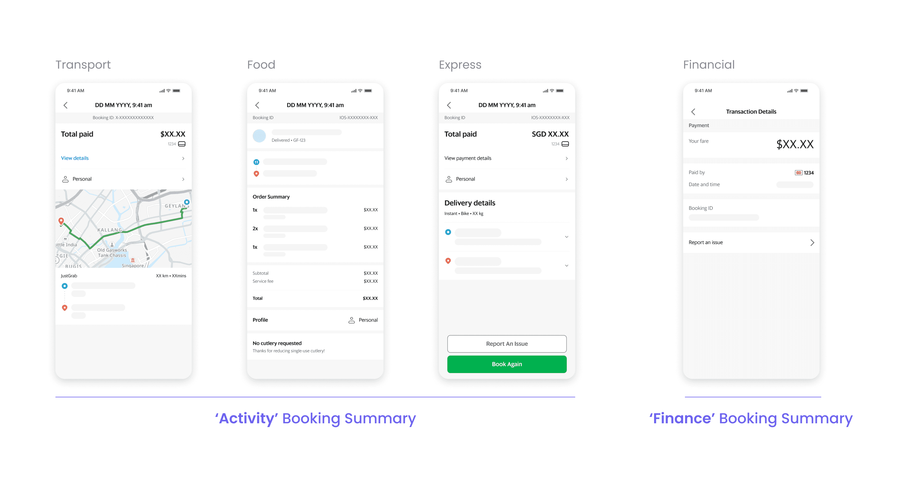
What are the common elements?
To determine a consistent way to display pre-auth information across different booking summaries, I began searching for common elements. That was when I noticed a standardized high-level structure across them.
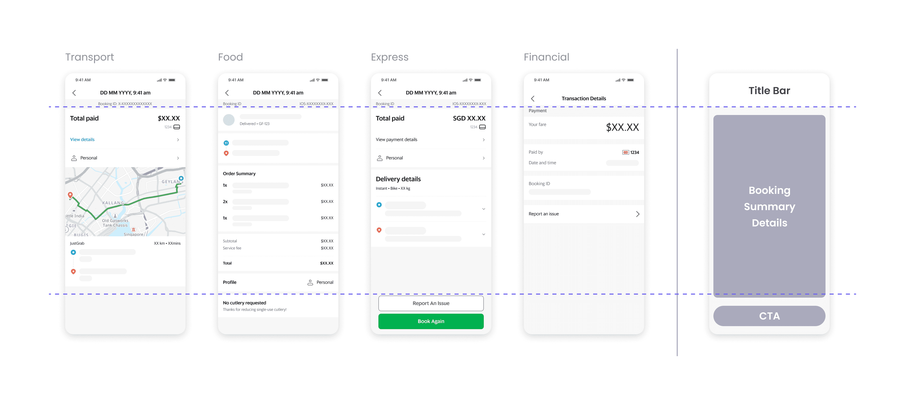
A simple solution: Info banners
I proposed that when pre-auth information is needed, it should appear above the booking summary details. This approach keeps the solution consistent across screens, captures user attention effectively, and did not interfere with any their existing experience.

From solution to system
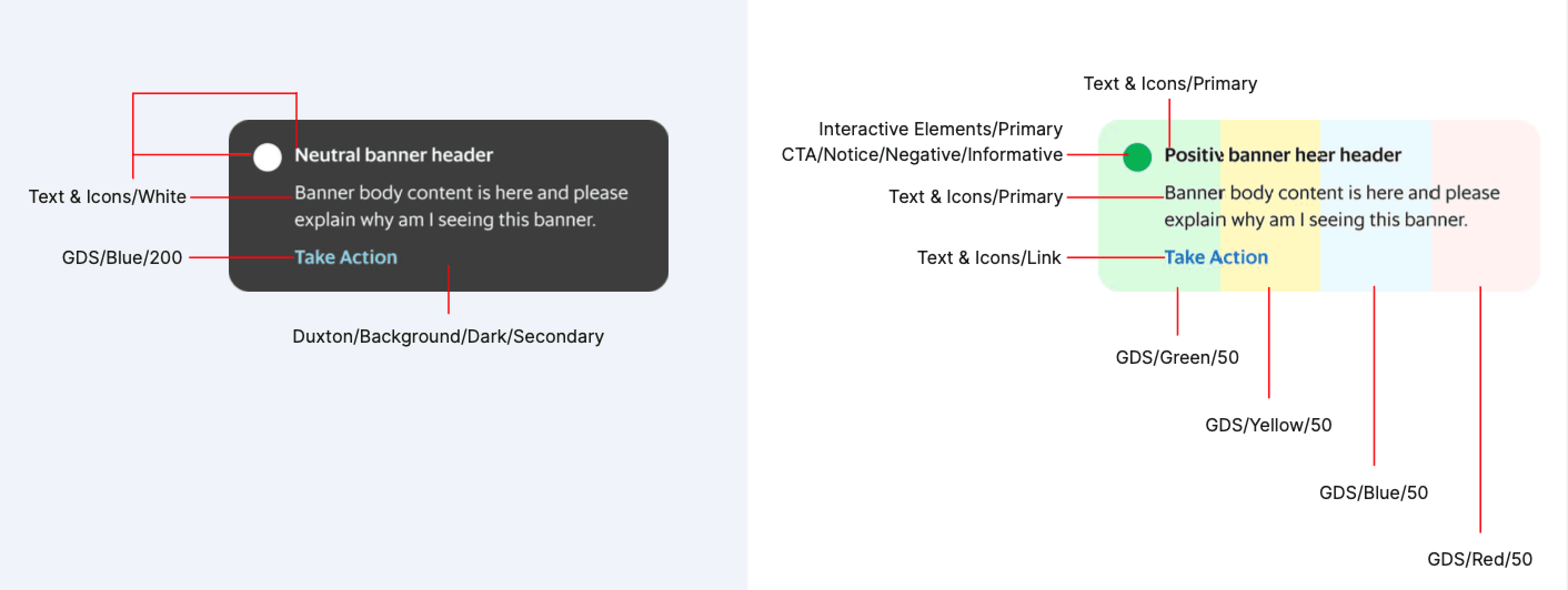
When I searched our design system library for existing info banner patterns, I discovered inconsistent implementations across different teams and products. This revealed a gap of having a standardized way to communicate time-sensitive and contextual information to our users.
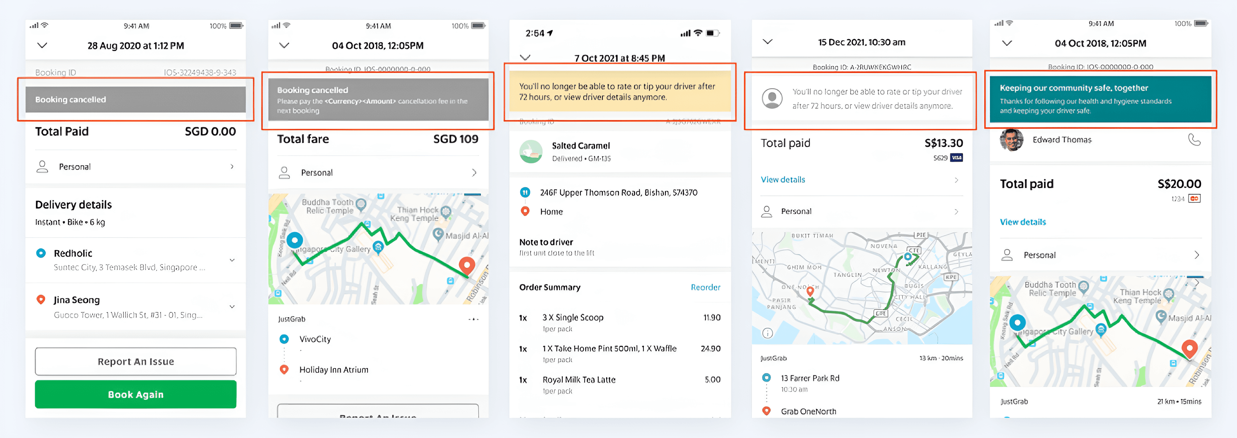
With a case in hand, I reached out to the Design System team to bridge a systemic communication gap i.e the lack of a standardized info banner. My goal was to ensure that no matter which part of the app a user was in, they received clear, high-priority information in a way they could instantly understand.
I established simple rules, such as using bold headers for skimming and specific colors and icons to signal urgency. Additionally, I created a usage guidelines so that other designers knew exactly when to use them, and when not to trigger during specific scenarios.
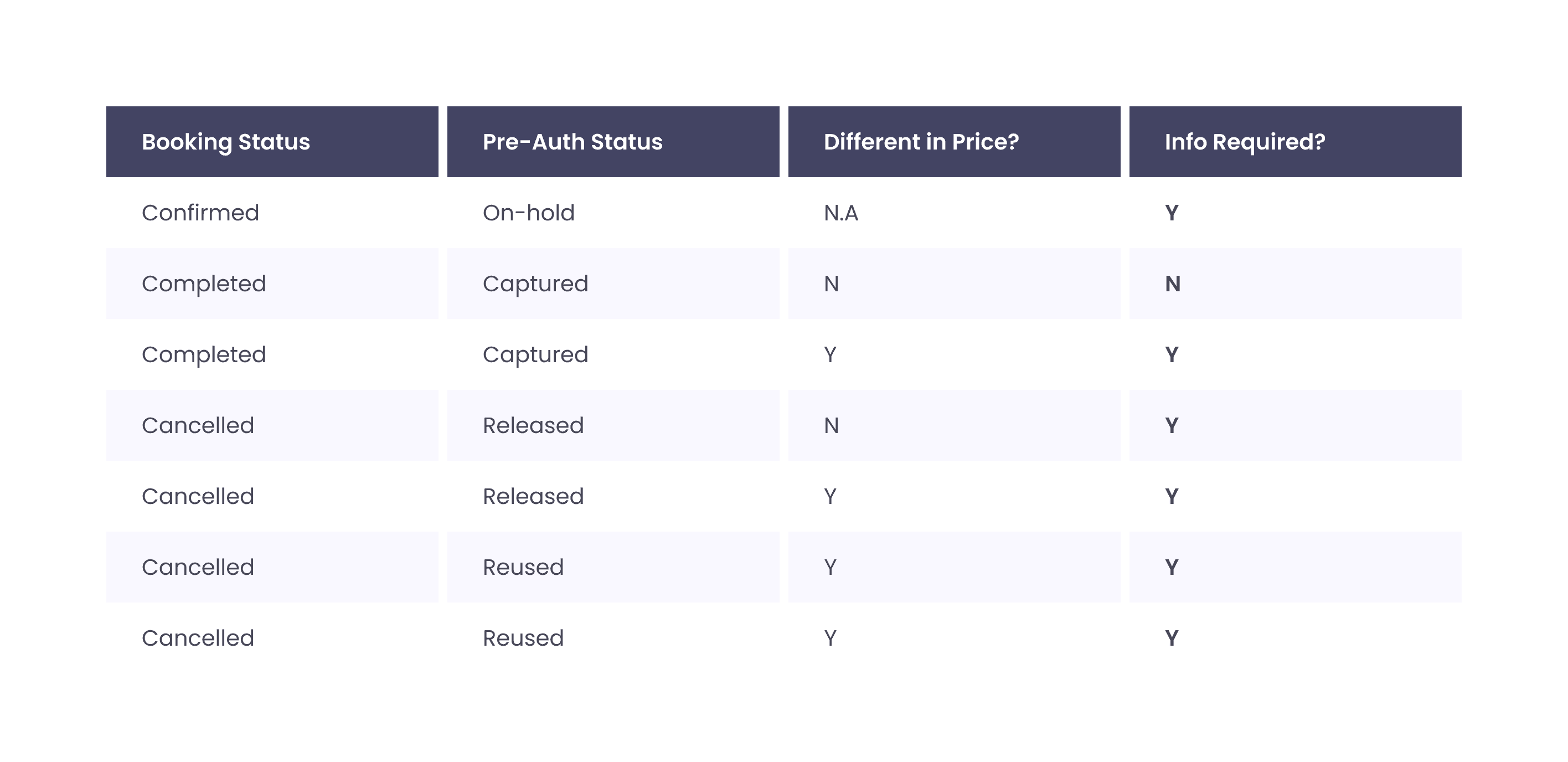
When should we inform about pre-authorization?
Together with my PM, we identified all possible pre-auth scenarios and determined when pre-auth information should be available in booking summaries.
Pre-auth messaging for clarity
Many users found pre-authorization confusing as banks often don’t provide clear information. To address this, I collaborated with our content designer to clarify the details that banks typically leave out. We also added actionable steps for users when required, which were previously missing.

With these principles in mind, we ensured that all new and existing messages provide clearer timeframes, reassurance, and next steps using concise and easily understood language, reducing users' mental load and confusion.

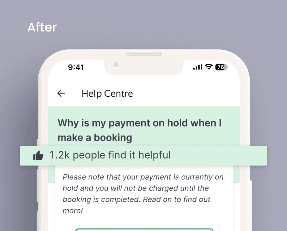
Last line of defense: help center articles

Impacts & Outcomes
-15%
12x 'Likes'
avg. 12K
Learnings & Takeaways
Complexity of trust
Initially, this project seemed straightforward, however, increasing user trust involves more than just reducing support tickets. Trust is intangible and fragile – it must be nurtured over time but also easily eroded even by the smallest mistakes. While lacking in-app pre-authorization information may seem minor, regaining user trust might not. If I could start over, I would advocate for long-term investments in monitoring and strategizing trust-building initiatives.